>

블로그

>

Color Management in Custom Playing Card Printing: From Design to Production

Color Management in Custom Playing Card Printing: From Design to Production

목차

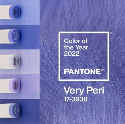
In the printing industry, colour is also an indispensable topic.To give a simple example: when you require custom playing card printing—say, you wish to order a pack of yellow playing cards but cannot describe the exact shade of yellow—providing the PANTONE colour code makes it very easy to identify that particular shade. The PANTONE colour system has long been an integral part of our daily lives, and it is particularly closely linked to the printing industry.

Color management is one of the most critical yet often overlooked aspects of custom playing card printing. Whether you’re producing a poker deck, 타로 카드, 트레이딩 카드, or educational flashcards, accurate and consistent color reproduction directly affects the quality, usability, and perceived value of your product.

이 가이드에서는, we will provide a detailed overview of the complete colour management workflow—from the preparation of design files to the final quality inspection—and explain how professional playing card manufacturers ensure that every deck of cards meets the expectations set for your design.

Why Color Management Matters in Custom Playing Card Printing

When designing any product, colour serves as an expression of a brand’s visual identity. Recently, a high-profile cross-industry intellectual property dispute arose. The dispute stemmed from Nike launching a pair of trainers featuring colours highly similar to 7-Eleven’s iconic colour scheme without authorisation. The trainers featured orange, green and red stripes similar to those on the 7-Eleven sign, prompting 7-Eleven China to sue Nike, alleging that the colour scheme of its latest design plagiarised 7-Eleven’s iconic three-colour logo.

This demonstrates just how crucial the exclusive use of colour is to the visual identity and brand image of a logo. It silently influences users’ emotional connection to and perception of a brand.

Just imagine opening a pack of playing cards and finding that some cards have a slightly darker back colour than others, or that there are noticeable colour variations between different printing batches. Even the slightest colour variation can diminish the perceived quality of the product and have a negative impact on customer satisfaction.
For many card products, colour also serves an important functional purpose.
예를 들어, magic playing cards rely on clear suit symbols and highly recognisable colours. Collectible trading cards require vibrant illustrations to showcase each character’s special effects and magical abilities, tarot cards use colour to convey their mystical characteristics; 교육용 플래시카드, meanwhile, place greater emphasis on colour accuracy.
In commercial printing, maintaining this level of consistency is by no means as simple as merely loading ink into the printing press. Professional manufacturers control multiple variables throughout the production process, including colour profiles, paper characteristics, ink density, environmental conditions and post-press processes.
This entire workflow is known as colour management, and it plays a crucial role in the production of high-quality custom playing cards.
Through colour, playing card designers can shape the user experience and create playing cards unique to their brand; when customers see a particular colour combination, they will immediately think of your playing cards.

Therefore, Each card in a deck is compared as a single unit; as it forms a whole, the colours on the front and back must match. There must be no colour discrepancies within a single deck, and colour consistency must be maintained across multiple production runs. Only cards with consistent colours are considered complete. Therefore, before printing begins, we need to provide the printer with the most accurate colour reference files.

Understanding Color Systems in Commercial Printing

RGB vs CMYK

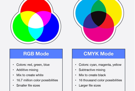
RGB (Red, Green, and Blue) is an additive color model used for digital displays such as computer monitors, 스마트폰, and televisions. It creates a wide range of colors by blending different intensities of red, green, and blue light. The more light that is combined, the brighter the resulting color appears.

CMYK (청록색, 마젠타, 노란색, and Key/Black) is the standard color model for commercial printing. Rather than producing colors with light, CMYK generates them by layering inks that absorb and reflect specific wavelengths of light on paper. Because printed materials rely on ink instead of illuminated pixels, CMYK is the preferred choice for packaging, 서적, 카드 놀이, and other printed products.

a057acba-0c14-43eb-a6a3-40a85b57cd1b

Most playing card artwork is created digitally using the RGB color mode because computer monitors, 정제, and smartphones display colors with red, green, and blue light. RGB offers a wider color gamut and can produce brighter, more vibrant colors on screen.

하지만, commercial printing uses CMYK inks—cyan, magenta, yellow, and black—to reproduce colors on paper. During production, RGB files are converted to CMYK, which may cause slight color shifts if the artwork is not prepared correctly.

For custom playing card printing, we recommend designing directly in CMYK or converting artwork before final approval. This minimizes unexpected color differences and ensures the printed cards closely match your expectations.

Key Points

  • RGB is used for digital displays.
  • CMYK is the industry standard for printing.
  • RGB colors may appear less vibrant after conversion.
  • CMYK artwork provides more predictable print results.

Pantone (PMS) 그림 물감

PANTONE is a world-renowned authority specialising in the development and research of colour. (~ 안에 1962, Lawrence Herbert, founder of Pantone, developed a revolutionary colour system enabling the identification, matching and communication of colours, thereby resolving issues relating to the production of precise colour matches in the graphic design industry. Recognising that individuals perceive the same spectrum differently, he pioneered the PANTONE MATCHING SYSTEM, a fan-shaped colour guide containing standard colours.)

The PANTONE colour chart (as shown on the right) is an internationally recognised standard colour chart and a world-renowned authority on colour. It encompasses colour communication systems across sectors such as printing, textiles, plastics, graphic design and digital technology, and has become the internationally standardised language for communicating colour information today. Countries around the world have widely adopted the unified spot colour standards set by the US-based PANTONE, and the PANTONE colour chart has thus become the medium through which colour is conveyed.

30447aa2-d46b-446e-8bea-e74994b162a6

Pantone Matching System (PMS) is the world’s most recognized color standard for brand consistency. Each Pantone color is assigned a unique code, allowing printers worldwide to reproduce the same color accurately.

For custom playing cards, Pantone colors are commonly used for company logos, brand identity, tournament cards, promotional decks, and luxury packaging. Metallic gold, 은, and fluorescent inks are also available through Pantone spot color printing.

When exact brand colors are required, Pantone printing provides greater consistency than standard CMYK printing.

Common Applications

  • Brand logos
  • Corporate identity
  • Premium playing cards
  • Luxury tuck boxes
  • Metallic foil coordination

Spot Color vs Process Color

Spot color and process color serve different printing purposes.

Process color uses four CMYK inks to reproduce full-color photographs and illustrations. It is the most economical solution for artwork containing gradients and multiple colors.

Spot color uses pre-mixed ink instead of combining CMYK inks during printing. This method delivers exceptional color accuracy and consistency, making it ideal for logos, solid backgrounds, and special colors that cannot be accurately reproduced in CMYK.

For most custom playing cards, CMYK printing is sufficient. 하지만, luxury editions and branded decks often combine CMYK with one or more spot colors to achieve premium visual results. Process Color (CMYK)Spot ColorUses four process inksUses pre-mixed inkBest for photosBest for logosLower costHigher color accuracyUnlimited image colorsPerfect for solid colors

Process Color (CMYK)Spot Color
Uses four process inksUses pre-mixed ink
Best for photosBest for logos
Lower costHigher color accuracy
Unlimited image colorsPerfect for solid colors

ICC Color Profiles

An ICC profile is a color management standard that ensures consistent color reproduction between different devices, including monitors, proofing systems, digital printers, and offset presses.

Without proper ICC profiles, the same artwork may appear different on each device. Professional printing factories use calibrated monitors, standardized lighting, and ICC workflows to maintain color consistency throughout production.

At Bonroy Printing, color-managed workflows help minimize color variation from digital artwork to finished playing cards, providing customers with reliable and repeatable print quality.

Benefits of ICC Profiles

  • Consistent screen-to-print color
  • Reduced color deviation
  • Accurate proofing
  • Stable production quality
  • Better communication between designers and printers

Common Artwork Issues That Affect Playing Card Color

Creating beautiful artwork is only the first step toward producing premium-quality custom playing cards. Even the most creative designs can suffer from unexpected color shifts, 흐릿한 이미지, or trimming errors if the production files are not prepared correctly.

Many color-related problems actually originate before printing begins. Incorrect color modes, low-resolution images, missing bleed areas, or improperly exported files can all affect the final appearance of your playing cards.

Below are some of the most common artwork issues we encounter during prepress inspection—and how to avoid them.

1、Using the RGB colour mode rather than CMYK

One of the most common mistakes is submitting artwork designed in the RGB colour mode.

As mentioned above, RGB (red, green, 파란색) is designed specifically for digital display devices such as monitors, smartphones and tablets. Because screens emit light, RGB is capable of rendering a wider, brighter and more saturated colour range than commercial printing presses.
하지만, professional custom playing card printing utilises the CMYK colour model (cyan, magenta, yellow and black). During the printing process, RGB artwork must be converted to CMYK, and certain colours cannot be reproduced accurately.

Best Practice

Before exporting print-ready files, ensure that your design is created or converted to CMYK mode. This helps minimise unexpected colour shifts and allows designers to preview colours more accurately prior to production.

2、Low-Resolution Images Reduce Print Quality

Image resolution has a direct impact on the sharpness and clarity of printed playing cards.

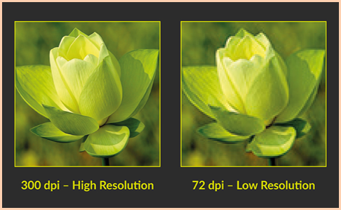
While images downloaded from websites or social media may look acceptable on screen, they are often only 72 DPI, which is far below commercial printing standards.

When enlarged for printing, low-resolution images may appear:

Blurry
Pixelated
Soft around the edges
Lacking fine details

The image below shows a comparison of the print results for images at different resolutions. Low-resolution source material can result in severe pixelation and blurring in the final product, which cannot be rectified in post-production; this is a detail that is easily overlooked in design but has a significant impact.

d8cf40be-f9ae-4a68-bef1-8a0fa6bfa29b

For playing cards, where artwork often contains intricate illustrations, decorative borders, and small text, image quality is especially important.

Professional printing typically requires artwork to be prepared at 300 DPI at the final print size.

3、Missing Bleed Can Cause White Edges

Playing cards are printed on large sheets and then trimmed into individual cards.

Because cutting machines have a small tolerance, artwork should always include a bleed area, usually around 3 mm, extending beyond the final trim line.

Without bleed, even a slight cutting variation may result in unwanted white edges or cropped backgrounds.

Likewise, important elements such as:

  • Card titles
  • 숫자
  • Logos
  • Suit symbols
  • Character illustrations

should remain inside the safe zone to prevent accidental trimming.

A properly prepared file with bleed helps ensure clean, professional-looking edges on every card.

4、Missing Fonts or Unoutlined Text

Failure to convert text to curves when submitting files, or the use of non-standard fonts, may result in garbled text, character corruption or the substitution of default fonts on the output device, thereby severely compromising the layout.

To avoid these issues, designers should convert all text to outlines before exporting, or embed the fonts when creating the PDF. This ensures that the design will be rendered exactly as intended throughout the production process.

5、Missing Linked Images or Transparency Issues

Complex artwork often contains linked images, transparent effects, shadows, or blending modes.

If these elements are not embedded correctly before exporting, unexpected issues may occur during printing, 포함:

Missing graphics
Transparency artifacts
Incorrect shadow rendering
Unexpected color changes

Flattening transparency and embedding all linked images before exporting can greatly reduce these risks.

Printing Technology and Color Control

To produce custom playing cards with vibrant and consistent colours, a high-quality printing press alone is far from sufficient. From press calibration to final inspection, every stage of production must be carefully monitored to ensure that the printed colours accurately reproduce the original design.
In a professional playing card manufacturing facility, colour management is a comprehensive quality control process rather than a single production step. Advanced measuring instruments, standardised lighting conditions and experienced quality control staff work in close collaboration to ensure colour consistency throughout the entire printing process.
The following are some key technologies and quality control procedures used to achieve reliable colour reproduction in the printing of custom playing cards.

Measuring Color with a Spectrophotometer

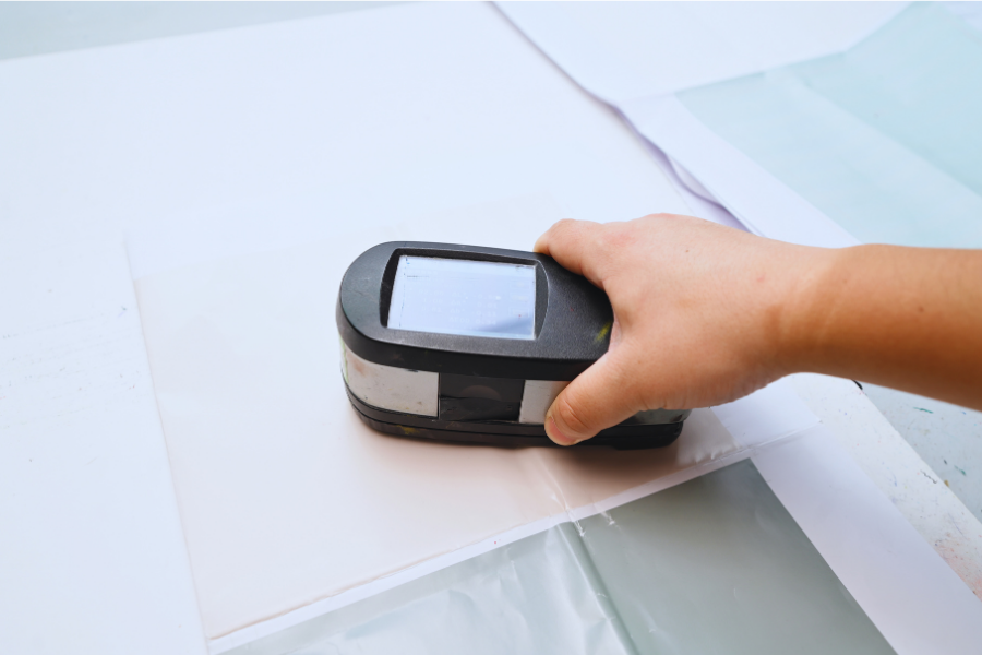
One of the most important tools in modern commercial printing is the spectrophotometer.

Unlike visual inspection, which can vary from person to person, a spectrophotometer measures color objectively by analyzing how light reflects from the printed surface.

The device compares printed colors with predefined target values and detects even subtle differences that may not be noticeable to the human eye.

Using spectrophotometric measurements allows printing technicians to:

Verify color accuracy
Maintain batch-to-batch consistency
Monitor ink density
Reduce subjective judgment
Improve repeatability for future reorders

For brands that require consistent color reproduction across multiple production runs, this technology provides a reliable scientific standard.

팁: If your factory uses an X-Rite, Techkon, or Konica Minolta spectrophotometer, you can mention the brand names. These are well-known in the international printing industry and help reinforce your technical credibility.

ABOUT PANTONE (1)

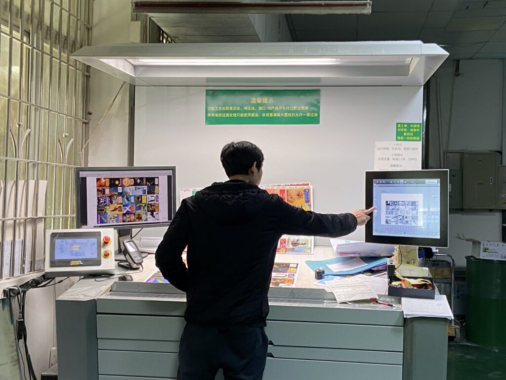
Print Inspection Under a Digital Viewing Booth

Printed colors can appear dramatically different under various lighting conditions. A card that looks accurate in an office may look warmer under incandescent lighting or cooler under daylight.

To eliminate this inconsistency, professional manufacturers inspect printed sheets using a Digital Viewing Booth equipped with standardized light sources.

These viewing systems simulate internationally recognized lighting conditions, allowing inspectors to evaluate colors in a controlled environment.

During inspection, technicians check:

  • Overall color accuracy
  • Color consistency across the sheet
  • Flesh tones and illustration details
  • Neutral gray balance
  • Brand color matching
  • Text readability
  • Registration accuracy

Because every inspection takes place under the same lighting conditions, color evaluations remain consistent regardless of the surrounding environment.

8927b6a37e463dade8e934caad97d20c

Why Professional Color Control Matters

Every stage of the printing process influences the final appearance of a custom playing card.

Without proper measurement and inspection, small color variations can accumulate and become noticeable in the finished deck. This is especially important for products featuring large areas of solid color, detailed illustrations, or brand-specific color requirements.

By combining calibrated printing equipment, objective color measurement, standardized viewing conditions, and rigorous quality inspections, professional manufacturers can achieve the consistency expected for premium custom playing cards.

Whether producing poker cards, 타로 데크, 트레이딩 카드, or educational flash cards, a comprehensive color control system helps ensure that every card reflects the designer’s original vision.

In summary, Xinyicard Printing is equipped with advanced, fully integrated printing facilities that keep pace with the latest industry innovations.

Our factory features abundant natural daylight through large glass windows, embraces sustainable manufacturing, and utilizes digital printing technology, eco-friendly soy-based inks, recyclable materials, and innovative recycled coffee-ground paper solutions.

파트너가 되어보세요 Xinyicard Printing and bring your custom playing card business to life with reliable quality, professional service, and sustainable printing solutions.

Why Choose Xinyi Card Printing for Color-Critical Projects

~에 신이 카드 인쇄, we understand that every deck of playing cards tells a story, and that accurate colour reproduction is essential to bringing that story to life.
Our production process combines state-of-the-art equipment, experienced technicians and rigorous quality control to ensure that every project meets professional printing standards.
As mentioned earlier, we offer professional pre-production design reviews; CMYK and Pantone colour management; and both offset and digital printing solutions.
Whether you are producing custom playing cards, 타로 카드, collectible trading cards, flashcards or board game cards, our team is committed to delivering consistent colour quality and exceptional craftsmanship.

자주 묻는 질문

1. What color mode should I use for custom playing card printing?

CMYK is the recommended color mode because commercial printing presses reproduce colors using cyan, magenta, yellow, and black inks. Designing in CMYK helps minimize unexpected color shifts.


2. Can you match my brand colors?

예. For projects requiring highly accurate brand colors, Pantone (PMS) color matching may be available. Our team can recommend the most suitable solution based on your design and production requirements.


3. Which paper is best for premium playing cards?

블랙 코어 종이 is widely considered the preferred choice for premium playing cards due to its excellent opacity, 내구성, and professional handling characteristics.


4. Is offset printing better than digital printing?

Offset printing generally provides superior color consistency and is the preferred choice for medium and large production runs. Digital printing is ideal for prototypes, samples, and smaller quantities.


5. Will matte lamination make my colors look dull?

Matte lamination softens reflections and creates a more elegant appearance. While colors may appear slightly less vibrant than with gloss lamination, many designers prefer the sophisticated finish it provides.


6. Should I request a printed proof?

If color accuracy is important to your project, a printed proof is highly recommended. It allows you to review colors, 삽화, and finishing before full production begins.


7. Can I reorder my deck with the same colors later?

예. By maintaining production records and following standardized color management procedures, professional manufacturers can help achieve consistent results across future print runs.


8. Do surface finishes affect color?

예. Different finishes influence how light interacts with the printed surface, which can make colors appear brighter, softer, richer, or more reflective.

사자 별자리

설립자 & CEO of Xinyi Printing As the Founder and CEO of Xinyi Printing, 나는 기업이 아이디어를 실용적인 고품질 인쇄물로 전환하도록 돕습니다., 생산 중심 솔루션. 알리바바 공인 스타강사 및 인쇄산업협회 부회장으로도 활동하고 있습니다., 현대 인쇄 및 제조에 대한 실무 통찰력 공유. 그리고 신이, 우리는 실제 생산 조건을 기반으로 맞춤형 인쇄 솔루션을 개발하여 고객이 올바른 재료를 선택할 수 있도록 돕습니다., 구조물, 비용 균형을 맞추는 사양, 내구성, 그리고 시각적인 효과. 새로운 프로젝트를 시작한다면, 우리 팀은 전체 생산 과정 전반에 걸쳐 지침과 지원을 제공할 것입니다.

연락하십시오

*우리는 귀하의 기밀성을 존중하고 모든 정보는 보호됩니다.

받은 편지함에 제품 카탈로그를 구입하십시오

맞춤형 카드 인쇄 솔루션의 전체 범위를 발견하십시오, 재료, 및 포장 옵션. 아래 양식을 작성하면 최신 제품 카탈로그를 이메일로 직접 보내드립니다..

종료 의도 팝업

*우리는 귀하의 기밀성을 존중하고 모든 정보는 보호됩니다.

지속 가능한 맞춤형 카드 인쇄, 전문적으로 전달되었습니다

데크에서 싱글까지, 우리는 고품질을 제공합니다, 업계 전문 지식에 의해 지원되는 완전히 맞춤형 카드 인쇄, 지속 가능한 재료, 엔드 투 엔드 지원.

*우리는 귀하의 기밀성을 존중하고 모든 정보는 보호됩니다.

종료 의도 팝업
카드 인쇄 가이드를 원합니다?

최신 제품 브로셔는 종이 유형부터 포장에 이르기까지 모든 것을 다룹니다. 다운로드를 제공 할 수 있도록 연락처 정보를 남겨주세요..

*우리는 귀하의 기밀성을 존중하고 모든 정보는 보호됩니다.

지속 가능한 맞춤형 인쇄, 전문적으로 전달되었습니다

우리는 고품질을 제공합니다, 완전 맞춤형 포장、카드 、업계 전문 지식을 바탕으로 한 도서 인쇄,지속 가능한 재료, 엔드투엔드 지원.

효율적인 생산

효율적인 생산

통합 포장 솔루션

통합 포장 솔루션

인증 & 신뢰할 수 있습니다

인증 & 신뢰할 수 있습니다

지속 가능성 & 친환경

지속 가능성 & 친환경

저희에게 연락하십시오