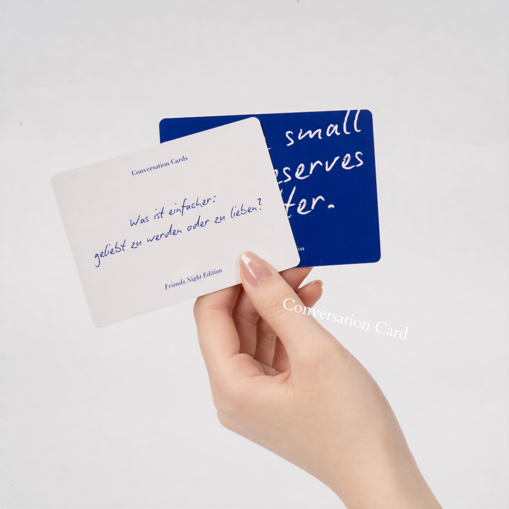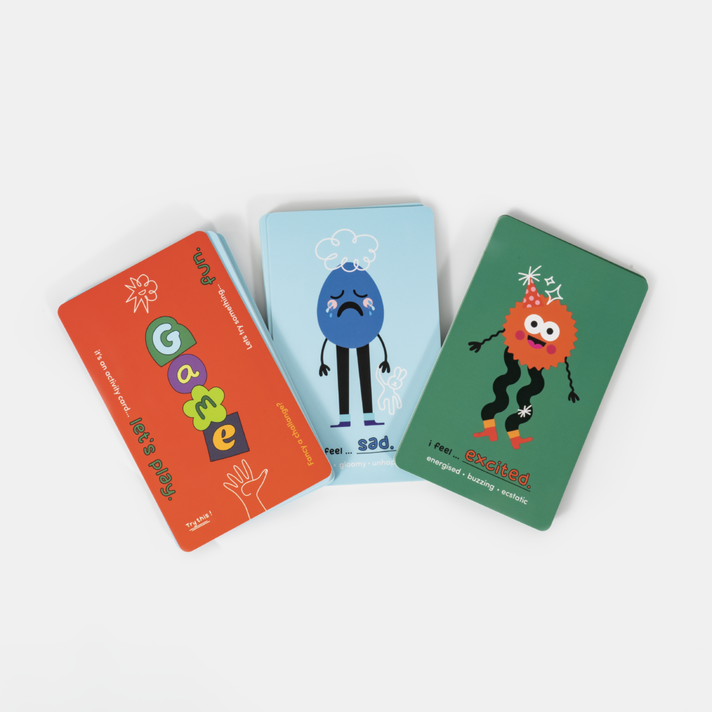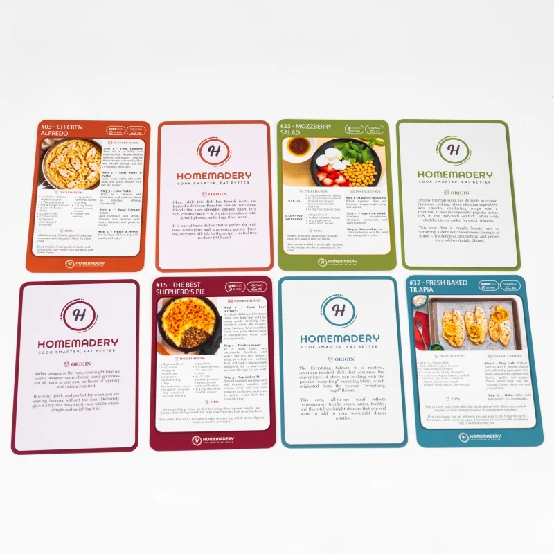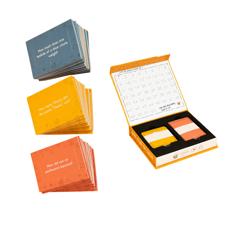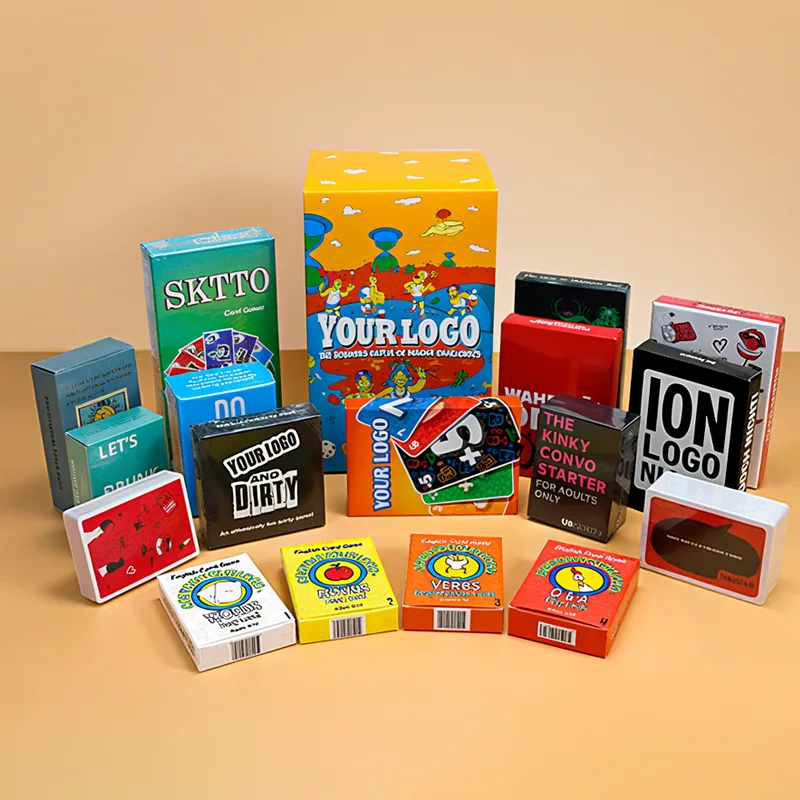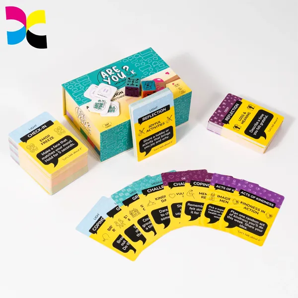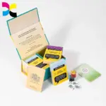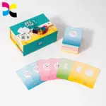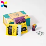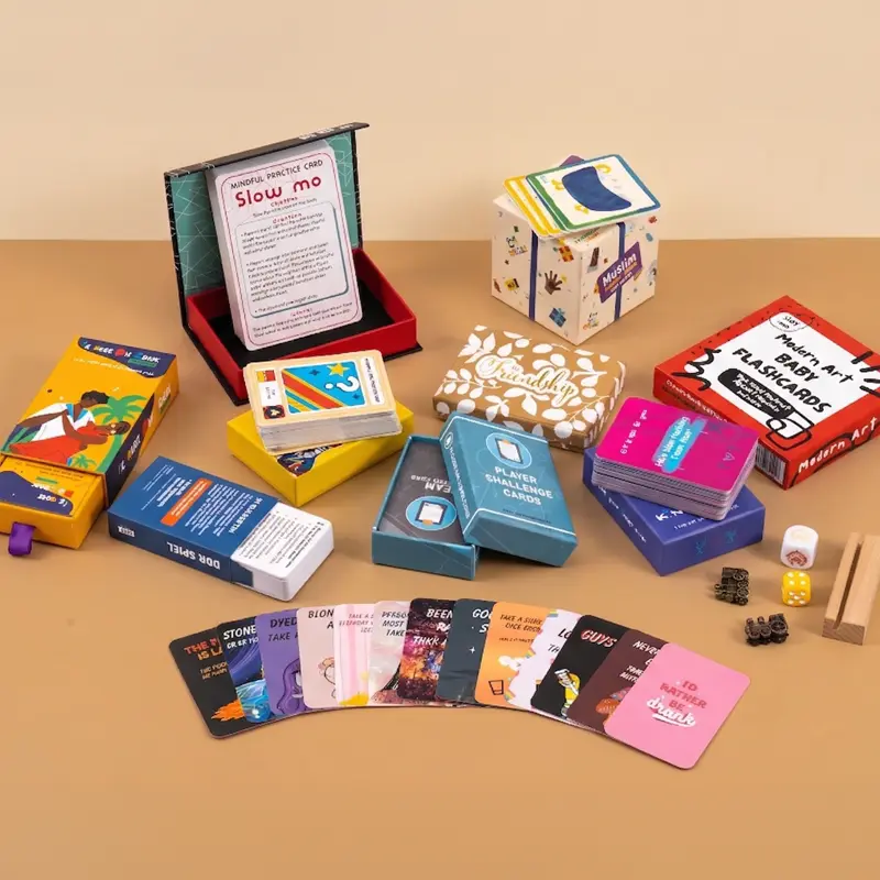
في صناعة الطباعة, اللون أيضًا موضوع لا غنى عنه. لإعطاء مثال بسيط: عندما تحتاج طباعة بطاقات اللعب المخصصة-يقول, إذا كنت ترغب في طلب مجموعة من أوراق اللعب الصفراء ولكنك لا تستطيع وصف الظل الدقيق للون الأصفر، فإن توفير رمز لون PANTONE يجعل من السهل جدًا تحديد هذا الظل المعين. لقد كان نظام ألوان PANTONE منذ فترة طويلة جزءًا لا يتجزأ من حياتنا اليومية, وترتبط بشكل خاص بصناعة الطباعة.
تعد إدارة الألوان أحد الجوانب الأكثر أهمية والتي يتم تجاهلها غالبًا في طباعة بطاقات اللعب المخصصة. سواء كنت تنتج مجموعة لعب البوكر, بطاقات التارو, بطاقات التداول, أو البطاقات التعليمية, يؤثر استنساخ الألوان الدقيق والمتسق بشكل مباشر على الجودة, سهولة الاستخدام, والقيمة المتصورة لمنتجك.
في هذا الدليل, سنقدم نظرة عامة تفصيلية عن سير العمل الكامل لإدارة الألوان — بدءًا من إعداد ملفات التصميم وحتى فحص الجودة النهائي — وسنشرح كيف مصنعي بطاقات اللعب المحترفين تأكد من أن كل مجموعة من البطاقات تلبي التوقعات المحددة لتصميمك.
لماذا تعتبر إدارة الألوان مهمة في طباعة بطاقات اللعب المخصصة
عند تصميم أي منتج, يعد اللون بمثابة تعبير عن الهوية المرئية للعلامة التجارية. حديثاً, نشأ نزاع رفيع المستوى حول الملكية الفكرية عبر الصناعة. نشأ النزاع بسبب قيام شركة Nike بإطلاق زوج من الأحذية الرياضية يتميز بألوان مشابهة إلى حد كبير لنظام الألوان الشهير لـ 7-Eleven دون تصريح. تميز المدربون باللون البرتقالي, خطوط خضراء وحمراء مشابهة لتلك الموجودة في علامة 7-Eleven, مما دفع 7-Eleven China إلى مقاضاة شركة Nike, تزعم أن نظام الألوان لأحدث تصميم لها ينتحل شعار 7-Eleven الشهير المكون من ثلاثة ألوان.
يوضح هذا مدى أهمية الاستخدام الحصري للألوان بالنسبة للهوية المرئية وصورة العلامة التجارية للشعار. إنه يؤثر بصمت على اتصال المستخدمين العاطفي بالعلامة التجارية وتصورهم لها.
فقط تخيل أنك تفتح مجموعة من أوراق اللعب وتجد أن بعض البطاقات لها لون خلفي أغمق قليلاً من غيرها, أو أن هناك اختلافات ملحوظة في الألوان بين دفعات الطباعة المختلفة. حتى أدنى اختلاف في اللون يمكن أن يقلل من جودة المنتج ويكون له تأثير سلبي على رضا العملاء.
للعديد من منتجات البطاقات, يخدم اللون أيضًا غرضًا وظيفيًا مهمًا.
على سبيل المثال, تعتمد أوراق اللعب السحرية على رموز بدلة واضحة وألوان مميزة للغاية. تتطلب بطاقات التداول القابلة للتحصيل رسومًا توضيحية نابضة بالحياة لعرض المؤثرات الخاصة لكل شخصية وقدراتها السحرية, تستخدم بطاقات التارو الألوان للتعبير عن خصائصها الغامضة; البطاقات التعليمية, في أثناء, التركيز بشكل أكبر على دقة الألوان.
في الطباعة التجارية, إن الحفاظ على هذا المستوى من الاتساق ليس بهذه البساطة على الإطلاق مثل مجرد تحميل الحبر في المطبعة. يتحكم المصنعون المحترفون في متغيرات متعددة طوال عملية الإنتاج, بما في ذلك ملفات تعريف الألوان, خصائص الورق, كثافة الحبر, الظروف البيئية وعمليات ما بعد الطباعة.
يُعرف سير العمل بأكمله باسم إدارة الألوان, ويلعب دورًا حاسمًا في إنتاج أوراق اللعب المخصصة عالية الجودة.
من خلال اللون, يمكن لمصممي بطاقات اللعب تشكيل تجربة المستخدم وإنشاء أوراق لعب فريدة لعلامتهم التجارية; عندما يرى العملاء مجموعة ألوان معينة, سوف يفكرون على الفور في أوراق اللعب الخاصة بك.
لذلك, تتم مقارنة كل بطاقة في المجموعة كوحدة واحدة; كما يشكل الكل, يجب أن تتطابق الألوان الموجودة في الأمام والخلف. يجب ألا يكون هناك اختلافات في الألوان داخل سطح واحد, ويجب الحفاظ على تناسق الألوان عبر عمليات الإنتاج المتعددة. تعتبر البطاقات ذات الألوان المتناسقة فقط كاملة. لذلك, قبل أن تبدأ الطباعة, نحن بحاجة إلى تزويد الطابعة بالملفات المرجعية الملونة الأكثر دقة.
فهم أنظمة الألوان في الطباعة التجارية
RGB مقابل CMYK
RGB (أحمر, أخضر, والأزرق) هو نموذج ألوان مضافة يستخدم للشاشات الرقمية مثل شاشات الكمبيوتر, الهواتف الذكية, وأجهزة التلفاز. إنه يخلق مجموعة واسعة من الألوان عن طريق مزج كثافات مختلفة من اللون الأحمر, أخضر, والضوء الأزرق. والمزيد من الضوء الذي يتم دمجه, كلما ظهر اللون الناتج أكثر إشراقا.
كميك (سماوي, أرجواني, أصفر, والمفتاح/أسود) هو نموذج الألوان القياسي للطباعة التجارية. بدلاً من إنتاج الألوان بالضوء, يقوم CMYK بإنشائها عن طريق طبقات من الأحبار التي تمتص وتعكس أطوال موجية محددة من الضوء على الورق. لأن المواد المطبوعة تعتمد على الحبر بدلاً من البيكسلات المضيئة, CMYK هو الخيار المفضل للتغليف, كتب, لعب الورق, وغيرها من المنتجات المطبوعة.
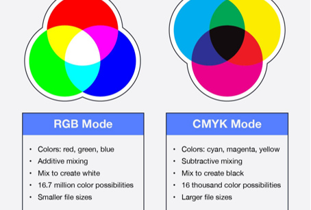
يتم إنشاء معظم الأعمال الفنية لبطاقات اللعب رقميًا باستخدام وضع ألوان RGB مثل شاشات الكمبيوتر, أقراص, والهواتف الذكية تعرض الألوان باللون الأحمر, أخضر, والضوء الأزرق. يوفر نظام RGB نطاقًا لونيًا أوسع ويمكن أن ينتج ألوانًا أكثر سطوعًا, ألوان أكثر حيوية على الشاشة.
لكن, تستخدم الطباعة التجارية أحبار CMYK — سماوي, أرجواني, أصفر, والأسود - لإعادة إنتاج الألوان على الورق. أثناء الإنتاج, يتم تحويل ملفات RGB إلى CMYK, مما قد يتسبب في تغيرات طفيفة في اللون إذا لم يتم إعداد العمل الفني بشكل صحيح.
لطباعة بطاقات اللعب المخصصة, نوصي بالتصميم مباشرة في CMYK أو تحويل العمل الفني قبل الموافقة النهائية. وهذا يقلل من الاختلافات غير المتوقعة في اللون ويضمن أن البطاقات المطبوعة تتوافق بشكل وثيق مع توقعاتك.
النقاط الرئيسية
- يستخدم RGB للشاشات الرقمية.
- CMYK هو المعيار الصناعي للطباعة.
- قد تظهر ألوان RGB أقل حيوية بعد التحويل.
- يوفر العمل الفني CMYK نتائج طباعة أكثر قابلية للتنبؤ بها.
بانتون (الدورة الشهرية) الألوان
PANTONE هي هيئة ذات شهرة عالمية متخصصة في تطوير وأبحاث الألوان. (في 1962, لورانس هربرت, مؤسس بانتون, طورت نظام ألوان ثوري يتيح تحديد الهوية, مطابقة الألوان والتواصل, وبالتالي حل المشكلات المتعلقة بإنتاج مطابقة الألوان الدقيقة في صناعة التصميم الجرافيكي. إدراك أن الأفراد ينظرون إلى نفس الطيف بشكل مختلف, كان رائدا في نظام مطابقة بانتون, دليل ألوان على شكل مروحة يحتوي على ألوان قياسية.)
مخطط ألوان بانتون (كما هو موضح على اليمين) هو مخطط ألوان قياسي معترف به دوليًا وسلطة ذات شهرة عالمية في مجال الألوان. ويشمل أنظمة الاتصالات الملونة عبر قطاعات مثل الطباعة, المنسوجات, البلاستيك, التصميم الجرافيكي والتكنولوجيا الرقمية, وأصبحت اللغة الموحدة عالميًا لتوصيل معلومات الألوان اليوم. اعتمدت البلدان في جميع أنحاء العالم على نطاق واسع معايير الألوان الموضعية الموحدة التي وضعتها شركة PANTONE ومقرها الولايات المتحدة, وبذلك أصبح مخطط ألوان PANTONE هو الوسيط الذي يتم من خلاله نقل اللون.


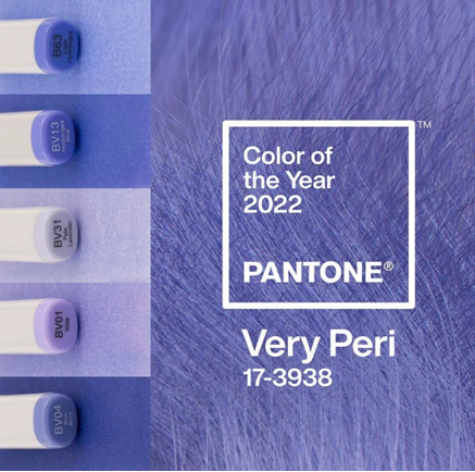
نظام مطابقة بانتون (الدورة الشهرية) هو معيار الألوان الأكثر شهرة في العالم لتناسق العلامة التجارية. يتم تعيين رمز فريد لكل لون Pantone, السماح للطابعات في جميع أنحاء العالم بإعادة إنتاج نفس اللون بدقة.
لأوراق اللعب المخصصة, تُستخدم ألوان Pantone بشكل شائع في شعارات الشركات, هوية العلامة التجارية, بطاقات البطولة, الطوابق الترويجية, والتغليف الفاخر. الذهب المعدني, فضي, والأحبار الفلورية متاحة أيضًا من خلال طباعة الألوان الموضعية من Pantone.
عندما تكون هناك حاجة إلى ألوان العلامة التجارية الدقيقة, توفر طباعة Pantone تناسقًا أكبر من طباعة CMYK القياسية.
التطبيقات المشتركة
- شعارات العلامة التجارية
- هوية الشركة
- أوراق اللعب المميزة
- صناديق الثنية الفاخرة
- تنسيق رقائق معدنية
اللون الموضعي مقابل لون المعالجة
يخدم اللون الموضعي ولون المعالجة أغراض طباعة مختلفة.
يستخدم لون المعالجة أربعة أحبار CMYK لإنتاج صور فوتوغرافية ورسوم توضيحية كاملة الألوان. إنه الحل الأكثر اقتصادا للأعمال الفنية التي تحتوي على تدرجات وألوان متعددة.
يستخدم اللون الموضعي حبرًا مختلطًا مسبقًا بدلاً من دمج أحبار CMYK أثناء الطباعة. توفر هذه الطريقة دقة ألوان وتناسقًا استثنائيين, مما يجعلها مثالية للشعارات, خلفيات صلبة, والألوان الخاصة التي لا يمكن إعادة إنتاجها بدقة في CMYK.
لمعظم أوراق اللعب المخصصة, طباعة CMYK كافية. لكن, غالبًا ما تجمع الإصدارات الفاخرة والطوابق ذات العلامات التجارية بين CMYK وواحد أو أكثر من الألوان الموضعية لتحقيق نتائج مرئية متميزة. لون العملية (كميك)اللون الموضعي يستخدم أربعة أحبار معالجة يستخدم الحبر المختلط مسبقًا، الأفضل للصور، الأفضل للشعارات، تكلفة أقل، دقة ألوان أعلى، ألوان صور غير محدودة، مثالي للألوان الصلبة
| لون العملية (كميك) | لون البقعة |
| يستخدم أربعة أحبار عملية | يستخدم الحبر المختلط مسبقًا |
| الأفضل للصور | الأفضل للشعارات |
| تكلفة أقل | دقة ألوان أعلى |
| ألوان صور غير محدودة | مثالية للألوان الصلبة |
ملفات تعريف ألوان ICC
يعد ملف تعريف ICC أحد معايير إدارة الألوان التي تضمن إعادة إنتاج الألوان بشكل متناسق بين الأجهزة المختلفة, بما في ذلك المراقبين, أنظمة التدقيق, الطابعات الرقمية, ومطابع الأوفست.
بدون ملفات تعريف ICC المناسبة, قد يظهر نفس العمل الفني مختلفًا على كل جهاز. تستخدم مصانع الطباعة الاحترافية شاشات معايرة, الإضاءة الموحدة, وسير عمل ICC للحفاظ على تناسق الألوان طوال فترة الإنتاج.
في مطبعة بونروي, تساعد مسارات العمل المُدارة بالألوان على تقليل تباين الألوان بدءًا من العمل الفني الرقمي وحتى أوراق اللعب النهائية, تزويد العملاء بجودة طباعة موثوقة وقابلة للتكرار.
فوائد ملفات تعريف ICC
- لون متناسق للطباعة على الشاشة
- انخفاض انحراف اللون
- التدقيق الدقيق
- جودة الإنتاج مستقرة
- تواصل أفضل بين المصممين والطابعات
مشكلات العمل الفني الشائعة التي تؤثر على لون بطاقة اللعب
إن إنشاء عمل فني جميل هو الخطوة الأولى فقط نحو إنتاج بطاقات لعب مخصصة عالية الجودة. حتى التصاميم الأكثر إبداعًا يمكن أن تعاني من تغيرات غير متوقعة في الألوان, صور ضبابية, أو أخطاء التشذيب إذا لم يتم إعداد ملفات الإنتاج بشكل صحيح.
تنشأ العديد من المشكلات المتعلقة بالألوان قبل بدء الطباعة. أوضاع الألوان غير الصحيحة, صور منخفضة الدقة, مناطق النزيف المفقودة, أو الملفات التي تم تصديرها بشكل غير صحيح يمكن أن تؤثر جميعها على المظهر النهائي لأوراق اللعب الخاصة بك.
فيما يلي بعض المشكلات الفنية الأكثر شيوعًا التي نواجهها أثناء فحص ما قبل الطباعة - وكيفية تجنبها.
1、استخدام وضع الألوان RGB بدلاً من CMYK
أحد الأخطاء الأكثر شيوعًا هو إرسال عمل فني مصمم في وضع الألوان RGB.
كما ذكر أعلاه, RGB (أحمر, أخضر, أزرق) تم تصميمه خصيصًا لأجهزة العرض الرقمية مثل الشاشات, الهواتف الذكية والأجهزة اللوحية. لأن الشاشات تنبعث منها الضوء, RGB قادر على تقديم نطاق أوسع, مجموعة ألوان أكثر سطوعًا وتشبعًا من المطابع التجارية.
لكن, تستخدم طباعة بطاقات اللعب المخصصة الاحترافية نموذج الألوان CMYK (سماوي, أرجواني, الأصفر والأسود). أثناء عملية الطباعة, يجب تحويل العمل الفني RGB إلى CMYK, ولا يمكن إعادة إنتاج ألوان معينة بدقة.
أفضل الممارسات
قبل تصدير الملفات الجاهزة للطباعة, تأكد من إنشاء التصميم الخاص بك أو تحويله إلى وضع CMYK. يساعد هذا في تقليل التحولات اللونية غير المتوقعة ويسمح للمصممين بمعاينة الألوان بشكل أكثر دقة قبل الإنتاج.
2、الصور منخفضة الدقة تقلل من جودة الطباعة
دقة الصورة لها تأثير مباشر على دقة ووضوح أوراق اللعب المطبوعة.
بينما قد تبدو الصور التي يتم تنزيلها من مواقع الويب أو وسائل التواصل الاجتماعي مقبولة على الشاشة, هم في كثير من الأحيان فقط 72 إدارة شؤون الإعلام, وهو أقل بكثير من معايير الطباعة التجارية.
عند تكبيرها للطباعة, قد تظهر صور منخفضة الدقة:
ضبابي
منقطة
ناعمة حول الحواف
تفتقر إلى التفاصيل الدقيقة
توضح الصورة أدناه مقارنة نتائج الطباعة للصور ذات الدقة المختلفة. يمكن أن تؤدي المواد المصدرية ذات الدقة المنخفضة إلى حدوث بكسلات شديدة وعدم وضوح في المنتج النهائي, والتي لا يمكن تصحيحها في مرحلة ما بعد الإنتاج; هذه تفاصيل يمكن التغاضي عنها بسهولة في التصميم ولكن لها تأثير كبير.
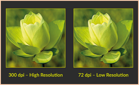
للعب الورق, حيث يحتوي العمل الفني غالبًا على رسوم توضيحية معقدة, الحدود الزخرفية, ونص صغير, جودة الصورة مهمة بشكل خاص.
تتطلب الطباعة الاحترافية عادةً إعداد عمل فني 300 DPI بحجم الطباعة النهائي.
3、فقدان النزيف يمكن أن يسبب حواف بيضاء
تتم طباعة أوراق اللعب على أوراق كبيرة ثم يتم تقطيعها إلى بطاقات فردية.
لأن آلات القطع لديها قدر ضئيل من التسامح, يجب أن يتضمن العمل الفني دائمًا أ منطقة النزيف, عادة حولها 3 مم, يمتد إلى ما بعد خط القطع النهائي.
بدون نزيف, حتى الاختلاف الطفيف في القطع قد يؤدي إلى حواف بيضاء أو خلفيات مقصوصة غير مرغوب فيها.
على نفس المنوال, عناصر مهمة مثل:
- عناوين البطاقة
- أرقام
- الشعارات
- رموز البدلة
- الرسوم التوضيحية للشخصية
يجب أن يبقى داخل منطقة آمنة لمنع التشذيب العرضي.
يساعد الملف الذي تم إعداده بشكل صحيح مع التسييل على ضمان التنظيف, حواف ذات مظهر احترافي على كل بطاقة.
4、الخطوط المفقودة أو النص غير المحدد
الفشل في تحويل النص إلى منحنيات عند إرسال الملفات, أو استخدام الخطوط غير القياسية, قد يؤدي إلى نص مشوه, تلف الأحرف أو استبدال الخطوط الافتراضية على جهاز الإخراج, وبالتالي المساس بشدة بالتخطيط.
لتجنب هذه القضايا, يجب على المصممين تحويل كل النص إلى مخططات تفصيلية قبل التصدير, أو قم بتضمين الخطوط عند إنشاء ملف PDF. وهذا يضمن أن التصميم سيتم تقديمه تمامًا كما هو مقصود طوال عملية الإنتاج.
5、الصور المرتبطة المفقودة أو مشكلات الشفافية
غالبًا ما يحتوي العمل الفني المعقد على صور مرتبطة, تأثيرات شفافة, الظلال, أو أوضاع المزج.
إذا لم يتم تضمين هذه العناصر بشكل صحيح قبل التصدير, قد تحدث مشكلات غير متوقعة أثناء الطباعة, مشتمل:
الرسومات المفقودة
التحف الشفافية
تقديم الظل غير صحيح
تغيرات اللون غير متوقعة
يمكن أن يؤدي تسوية الشفافية وتضمين جميع الصور المرتبطة قبل التصدير إلى تقليل هذه المخاطر بشكل كبير.
تكنولوجيا الطباعة والتحكم في الألوان
إنتاج أوراق لعب مخصصة بألوان نابضة بالحياة ومتناسقة, فالمطبعة عالية الجودة وحدها ليست كافية. من معايرة الصحافة إلى الفحص النهائي, يجب مراقبة كل مرحلة من مراحل الإنتاج بعناية للتأكد من أن الألوان المطبوعة تستنسخ التصميم الأصلي بدقة.
في منشأة تصنيع بطاقات اللعب الاحترافية, تعد إدارة الألوان عملية شاملة لمراقبة الجودة وليست خطوة إنتاج واحدة. أدوات القياس المتقدمة, تعمل ظروف الإضاءة الموحدة وموظفو مراقبة الجودة ذوي الخبرة في تعاون وثيق لضمان تناسق الألوان طوال عملية الطباعة بأكملها.
فيما يلي بعض التقنيات الأساسية وإجراءات مراقبة الجودة المستخدمة لتحقيق إعادة إنتاج الألوان بشكل موثوق في طباعة أوراق اللعب المخصصة.
قياس اللون باستخدام جهاز المطياف الضوئي
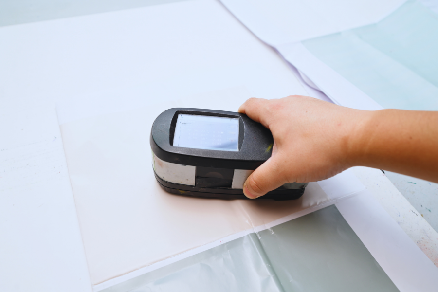
أحد أهم الأدوات في الطباعة التجارية الحديثة هو مقياس الطيف الضوئي.
على عكس الفحص البصري, والتي يمكن أن تختلف من شخص لآخر, يقيس مقياس الطيف الضوئي اللون بشكل موضوعي من خلال تحليل كيفية انعكاس الضوء من السطح المطبوع.
يقوم الجهاز بمقارنة الألوان المطبوعة مع القيم المستهدفة المحددة مسبقًا ويكتشف حتى الاختلافات الدقيقة التي قد لا تكون ملحوظة بالعين البشرية.
يتيح استخدام القياسات الطيفية لفنيي الطباعة القيام بذلك:
التحقق من دقة الألوان
الحفاظ على اتساق دفعة إلى دفعة
مراقبة كثافة الحبر
تقليل الحكم الذاتي
تحسين التكرار لعمليات إعادة الطلب المستقبلية
للعلامات التجارية التي تتطلب إعادة إنتاج ألوان متناسقة عبر عمليات إنتاج متعددة, توفر هذه التكنولوجيا معيارًا علميًا موثوقًا به.
نصيحة: إذا كان مصنعك يستخدم X-Rite, Techkon, أو مقياس الطيف الضوئي كونيكا مينولتا, يمكنك ذكر الأسماء التجارية. وهي معروفة جيدًا في صناعة الطباعة الدولية وتساعد في تعزيز مصداقيتك الفنية.
فحص الطباعة تحت حجرة العرض الرقمية
يمكن أن تظهر الألوان المطبوعة مختلفة بشكل كبير في ظل ظروف الإضاءة المختلفة. قد تبدو البطاقة التي تبدو دقيقة في المكتب أكثر دفئًا تحت الإضاءة المتوهجة أو أكثر برودة تحت ضوء النهار.
للقضاء على هذا التناقض, يقوم المصنعون المحترفون بفحص الأوراق المطبوعة باستخدام أ كشك المشاهدة الرقمية مجهزة بمصادر الضوء القياسية.
تحاكي أنظمة العرض هذه ظروف الإضاءة المعترف بها دوليًا, السماح للمفتشين بتقييم الألوان في بيئة خاضعة للرقابة.
أثناء التفتيش, فحص الفنيين:
- دقة الألوان الشاملة
- تناسق الألوان عبر الورقة
- نغمات اللحم وتفاصيل التوضيح
- توازن رمادي محايد
- مطابقة ألوان العلامة التجارية
- سهولة قراءة النص
- دقة التسجيل
لأن كل فحص يتم تحت نفس ظروف الإضاءة, تظل تقييمات الألوان ثابتة بغض النظر عن البيئة المحيطة.
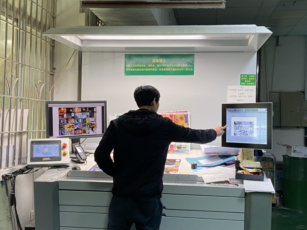
ما أهمية التحكم الاحترافي في الألوان؟
تؤثر كل مرحلة من مراحل عملية الطباعة على المظهر النهائي لبطاقة اللعب المخصصة.
دون القياس والتفتيش المناسب, يمكن أن تتراكم اختلافات الألوان الصغيرة وتصبح ملحوظة في السطح النهائي. هذا مهم بشكل خاص للمنتجات التي تتميز بمساحات كبيرة من الألوان الصلبة, الرسوم التوضيحية التفصيلية, أو متطلبات الألوان الخاصة بالعلامة التجارية.
من خلال الجمع بين معدات الطباعة المعايرة, قياس اللون الموضوعي, ظروف المشاهدة الموحدة, وفحوصات الجودة الصارمة, يمكن للمصنعين المحترفين تحقيق الاتساق المتوقع لبطاقات اللعب المخصصة المتميزة.
سواء إنتاج بطاقات البوكر, الطوابق التارو, بطاقات التداول, أو بطاقات فلاش تعليمية, يساعد نظام التحكم الشامل في الألوان على ضمان أن كل بطاقة تعكس الرؤية الأصلية للمصمم.
في ملخص, تم تجهيز طباعة Xinyicard بتقنيات متقدمة, مرافق طباعة متكاملة تمامًا تواكب أحدث ابتكارات الصناعة.
يتميز مصنعنا بوفرة ضوء النهار الطبيعي من خلال النوافذ الزجاجية الكبيرة, يحتضن التصنيع المستدام, ويستخدم تكنولوجيا الطباعة الرقمية, أحبار صديقة للبيئة تعتمد على الصويا, المواد القابلة لإعادة التدوير, وحلول مبتكرة لورق القهوة المطحونة المعاد تدويره.
شريك مع طباعة زينيكارد واجعل أعمال بطاقات اللعب المخصصة الخاصة بك تنبض بالحياة بجودة موثوقة, الخدمة المهنية, وحلول الطباعة المستدامة.
لماذا تختار طباعة بطاقة Xinyi للمشروعات ذات الألوان الحرجة
في طباعة بطاقة شينيى, نحن ندرك أن كل مجموعة من أوراق اللعب تحكي قصة, وأن إعادة إنتاج الألوان بدقة أمر ضروري لإضفاء الحيوية على هذه القصة.
تجمع عملية الإنتاج لدينا بين أحدث المعدات, الفنيين ذوي الخبرة ومراقبة الجودة الصارمة لضمان أن كل مشروع يلبي معايير الطباعة المهنية.
كما ذكرنا سابقا, نحن نقدم مراجعات تصميمية احترافية لمرحلة ما قبل الإنتاج; إدارة الألوان CMYK وPantone; وكلا حلول الطباعة الأوفست والرقمية.
سواء كنت تنتج أوراق اللعب المخصصة, بطاقات التارو, بطاقات التداول القابلة للتحصيل, البطاقات التعليمية أو بطاقات ألعاب الطاولة, يلتزم فريقنا بتقديم جودة ألوان ثابتة وحرفية استثنائية.
الأسئلة المتداولة
1. ما هو وضع الألوان الذي يجب أن أستخدمه لطباعة بطاقات اللعب المخصصة؟?
CMYK هو وضع الألوان الموصى به لأن المطابع التجارية تنتج الألوان باستخدام اللون السماوي, أرجواني, أصفر, والأحبار السوداء. يساعد التصميم في CMYK على تقليل التحولات اللونية غير المتوقعة.
2. هل يمكنك مطابقة ألوان علامتي التجارية؟?
نعم. للمشاريع التي تتطلب ألوانًا تجارية دقيقة للغاية, بانتون (الدورة الشهرية) قد تكون مطابقة الألوان متاحة. يمكن لفريقنا أن يوصي بالحل الأنسب بناءً على متطلبات التصميم والإنتاج الخاصة بك.
3. ما هي الورقة الأفضل لأوراق اللعب المميزة؟?
ورقة أساسية سوداء يعتبر على نطاق واسع الخيار المفضل لأوراق اللعب المتميزة بسبب عتامة ممتازة, متانة, وخصائص التعامل المهني.
4. هل طباعة الأوفست أفضل من الطباعة الرقمية؟?
توفر طباعة الأوفست عمومًا تناسقًا فائقًا للألوان وهي الخيار المفضل لعمليات الإنتاج المتوسطة والكبيرة. الطباعة الرقمية مثالية للنماذج الأولية, عينات, وكميات أقل.
5. هل سيجعل التصفيح غير اللامع ألواني تبدو باهتة؟?
يعمل التصفيح غير اللامع على تنعيم الانعكاسات ويخلق مظهرًا أكثر أناقة. بينما قد تبدو الألوان أقل حيوية قليلاً من التصفيح اللامع, يفضل العديد من المصممين اللمسات النهائية المتطورة التي يوفرها.
6. هل يجب أن أطلب إثباتًا مطبوعًا؟?
إذا كانت دقة الألوان مهمة لمشروعك, يوصى بشدة باستخدام دليل مطبوع. يسمح لك بمراجعة الألوان, عمل فني, والتشطيب قبل بدء الإنتاج الكامل.
7. هل يمكنني إعادة ترتيب مجموعتي بنفس الألوان لاحقًا?
نعم. من خلال الحفاظ على سجلات الإنتاج واتباع إجراءات إدارة الألوان الموحدة, يمكن للمصنعين المحترفين المساعدة في تحقيق نتائج متسقة عبر عمليات الطباعة المستقبلية.
8. هل تؤثر التشطيبات السطحية على اللون؟?
نعم. تؤثر التشطيبات المختلفة على كيفية تفاعل الضوء مع السطح المطبوع, والتي يمكن أن تجعل الألوان تبدو أكثر إشراقا, أكثر ليونة, أكثر ثراء, أو أكثر عاكسة.